Brand Identity
Introduction
Welcome to the official brand guidelines for Stadli. This site is the central source for our brand strategy, visual identity, voice, and assets. Use these guidelines to build cohesive, on-brand experiences.
Brand Platform
Our platform defines the strategic foundation of the Stadli brand. It is the "why" behind what we do, how we look, and how we speak.
Purpose
Make modern fandom easy for small, professional sports teams by unifying data and turning it into action fans can feel.
Positioning
The all-in-one revenue + marketing OS for sports teams. Anti-fragmentation. Pro-outcomes.
Personality
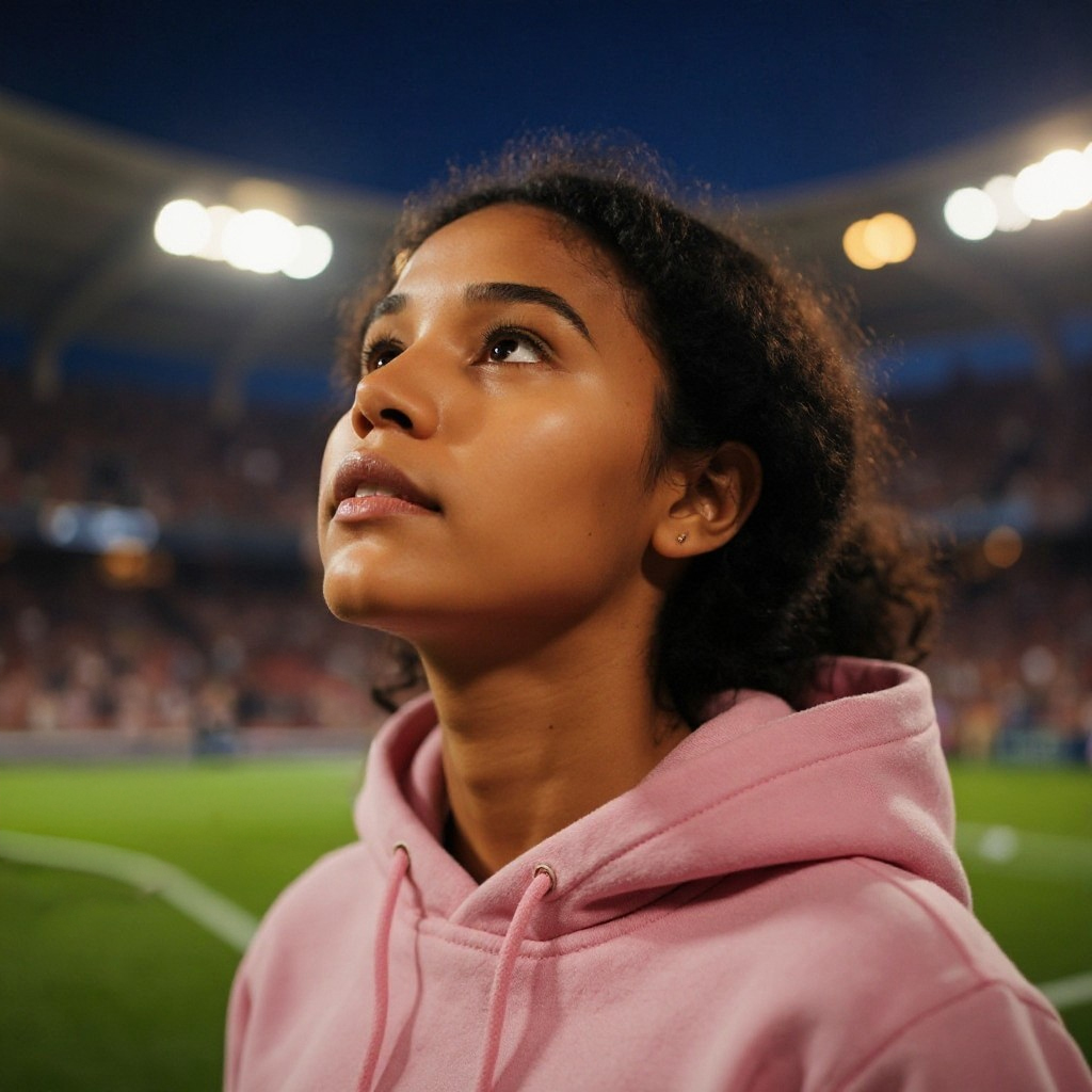
Visuals carry stadium emotion; product stays calm, legible, fast.
Audience
- Small to mid-size professional sports teams
- Marketing & revenue leaders
- Ops and data teams
- Modern enterprises in adjacent live-event verticals
Emotional Intent
Logo
Our wordmark is the most recognizable element of our brand. Consistent and correct application is crucial for maintaining brand integrity.
Primary Usage & Clear Space
White on dark backgrounds (Primary)
Black on light backgrounds
Clear Space
Maintain clear space equal to the cap-height of the 'S' in Stadli around the mark.
Minimum Digital: 20px height
Minimum Print: 6mm height
What to Avoid
Do not colorize
Do not apply effects
Do not rotate
Do not distort
Color System
Our color system is built on a neutral-first foundation with vibrant, purposeful accents that evoke stadium energy and guide user attention.
Principles
Neutral-first: Ink and Surface carry every background; Stadli White handles contrast.
Every accent use must have a clear reason—otherwise drop it.
Deep neutrals as canvas, vibrant accents drive attention.
Block-based layouts pair color fields with stark typography.
High contrast readability across text, data, and UI.
Photography and anchor content modules.
Neutrals
The neutral palette forms the backbone of our UI, ensuring a clean, focused, and high-contrast experience. They should comprise at least 85% of any design.
Ink
#0B0B0E
Primary backgrounds
Surface
#121418
Cards and panels
Stadli White
#FFFFFF
Primary text and icons
Surface Contrast
#171A1F
Inner borders & highlights
Text Secondary
#B7BEC7
Secondary text and labels
Text Muted
#8B92A1
Muted text and hints
Border
rgba(255,255,255,0.1)
Standard component border color
Accents
Accent colors are used sparingly (≤15%) to draw attention, convey meaning, and inject brand personality. Each family has a specific semantic purpose.
Magenta Blaze
Use for: Campaigns • Emotion: Excitement
light
#FF87C8
base
#FF2E9A
dark
#D40076
Aqua Teal
Use for: Engagement • Emotion: Freshness
light
#A3F9E8
base
#4CF3D1
dark
#00D1A7
Electric Orange
Use for: Revenue & Focus • Emotion: Urgency
light
#FF996F
base
#FF5A1F
dark
#D13A00
Sky Cyan
Use for: CRM • Emotion: Transparency
light
#98E5FF
base
#45D7FF
dark
#00B6E6
Pulse Green
Use for: Loyalty & Success • Emotion: Trust
light
#C2E0A6
base
#99CD64
dark
#72A93A
Ember Red
Use for: Alerts & Errors • Emotion: Intensity
light
#FF9D9D
base
#FF4B4B
dark
#E01C1C
In Practice
Feature Color Assignments
Key product areas are assigned a primary accent to create a consistent visual language.
Component States
Colors define the appearance and state of interactive elements across the platform.
Chips & Tags
Notifications
Success! Your campaign has been published.
Error: Payment failed. Please try again.
Typography
Our typography is built on 'Inter' for its clarity and impact. Hierarchy is driven by size, weight, and contrast to create a data-first, high-energy reading experience.
Display H1
For oversized hero headlines that need maximum impact.
Know every fan. Act on it.
H1
Standard page titles and primary headlines.
Unify Your Fans. Amplify Revenue.
H2
Section headers and major content groups.
The All-in-One Revenue OS
H3
Card titles and subsection headers.
Campaign Engine
Body
Default text for paragraphs and descriptive content.
Make modern fandom easy for small, professional sports teams by unifying data and turning it into action fans can feel. Our promise is to deliver big-league marketing power for lean front offices.
Eyebrow
Contextual labels placed above a headline, often using an accent color.
Powered By Stadli Analytics
Voice & Tone
How we speak: Direct, commercially honest, and full of stadium energy—without the clichés. Our voice is consistent, but our tone adapts to the context.
Our Voice Pillars
Direct & Declarative
We use big verbs and short sentences. We get straight to the point, conveying confidence and clarity.
Commercially Honest
We always connect features to outcomes, clearly naming the revenue impact for our clients.
Human
Our energy is inspired by the stadium atmosphere, but we avoid jargon and focus on authentic connection.
Inclusive
Our language reflects the full spectrum of fans, teams, and communities we serve.
Tone Sliders: Adapting to Context
Hero Messaging & Ads
High-energy, declarative, 5–8 words.
Product UI & Docs
Crisp, instructive, friendly imperatives.
Data & Reports
Calm, factual, with a short “So what?”
Sensitive Comms
Clear, empathetic, solution-first.
Copy Patterns in Action
Headlines
Primary CTAs
Secondary CTAs
Motion
Our motion identity reflects the energy of a live game. Animations are fast, confident, and purposeful, guiding the user's focus and making data feel dynamic.
Core Animation Principles
Entrance
Elements enter with a subtle upward slide and fade-in, creating a smooth, confident appearance.
Hover & Elevate
Interactive elements elevate on hover, providing clear visual feedback and a sense of depth.
Pulse & Highlight
Key indicators or live data points use a subtle pulse to draw attention without being distracting.
Data Viz Motion
Charts animate into view, making data clear and dynamic.
Staggered Reveal
Items in a list appear sequentially, guiding focus in a natural rhythm.
Focus Glow
Accent glows trace key elements to draw attention with purpose.
UI Components
This is where the brand system comes to life. Below are examples of how our identity is applied to key components within the Stadli platform.
360° Fan Profile Component
360° Fan Profile
Get a unified view of fan interactions and activities.
Jane Doe
LOYALTY
85%
ENGAGEMENT
124
CRM
$5,230
Analytics Component (Line Graph)
Analytics
fans can feel.
Track narratives with Stadli Narratives.
Analytics Component (Bar Chart)
Analytics
fans can feel.
Translate raw data into clear actions that boost engagement and revenue.
Website Builder Component
Build your website
Easily create and publish stunning web pages.

Templates & Assets
Download ready-to-use templates built on our brand DNA. Each asset follows our core brand principles: bold, data-first, and built for outcomes.
Landing Page Hero
A classic hero layout for landing pages that need to make a strong, immediate impression.
Download Figma FileFeature Announcement
A modular email template for announcing new features or campaigns, designed for high engagement.
Download HTML FilePitch Deck Kit
A 4-slide starter deck for sales pitches or internal presentations, designed to be clean and impactful.
Download Keynote File